Saturday, March 27, 2010

Virtual Home - Upstairs


Went out to the block on Friday, hoping to find a slab. It's not there yet. Still just the steel and poly waffle things. So as there is no more real progress since the last blog, I've been playing with the "My Virtual Home Disc." I've done the upstairs floor plan. Here is the view looking from our bedroom at the back along the hallway to the rumpus room at the of the hall.

Wednesday, March 24, 2010

Pollywaffles and Steel


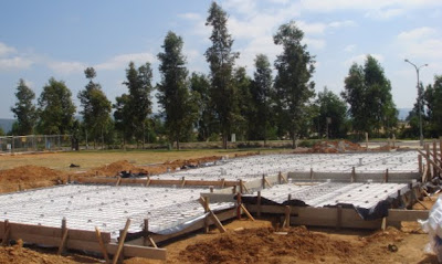
I took a trip out to the block today, and pleasingly saw a team of steel fixers laying the reinforced steel ready for the concrete slab to be poured. I asked when they are pouring it, and all things going well, it should be poured tomorrow. Even with just the poly waffles there and the form work, I can get a really good indication of how much yard we'll have left. Good progress so far.

Sunday, March 21, 2010

Brick Selection


We chose the Boral Blackheath, as they look great, and were about 1/4 of the upgrade cost of some of the others that we liked. Some of the upgrade cost quotes came in at $4-$5K, so these, at $1200, make a good value alternative.

Roof tile selection


The roof will be tiled with monier traditional roof tiles, in barramundi colour. We like the colourbond roofing, but couldn't justify the upgrade cost.

External Colouring


We have opted for ironstone for the gutters and downpipes, which should match relatively closely to the notre dame window frame colours.

Colours


We have picked dune for the colour for our fascia and for the front door.

3d Floor plan


Here is the floor plan in 3d. I like the fact that you can try out all different colour schemes. I am surprised that Eden Brae don't have something like this at the colour selection appointment to help you with selection of the colours.
The bricks are similar to ours. We have gone with Boral's Blackheath, which were one of the less expensive bricks that we liked in the upgrade list. I think the upgrade was around $1200.

3d Computer Model


The view in from the front door

3D Al-Fresco


Another 3d mock up. This one is of the alfresco, which differs from the usual floor plan as it has an access door to the garage.

My virtual home


I've been playing around with the "My Virtual Home" program, which came free on an issue of Better Homes and Gardens. For a free program, it is pretty good. It allows you to do a 3d mock up of your home, and walk through it, change decoration and furniture, and gives us a pretty good idea of what to expect from our modified floor plan. I've attached a few images i've created with it.

Kitchen Colours


The Kitchen colours are Moleskin , for the units, and Quicksand for the benches. Hopefully they will look good together. We managed to forget to take a photo of the splash back tiles, but they are a chocolate colour.

Upstairs Floor Plan


As you can see, the upstairs floor plan has been modified from the standard. The front bedroom has become the rumpus. We've added a new wall, where the rumpus used to be, to turn it into a bedroom.

We should get the most out of the balconies with this modification.

This change also gave us a little more room in the bedrooms which we were able to use to increase the built in wardobe space. We also managed to get a laundry press in as well, to compensate for the deleted one downstairs where we put the downstairs shower in.

Saturday, March 20, 2010

Colours and Tiles


I'll post all of the color selections when I get a bit more time, but here is the ensuite bathroom tile selections. Brown floor tiles, a Brown feature strip, and alabaster wall tiles.

More piers

Getting the picture


We can begin to visualise where things are a little better now. Here you can see where the balconies will go. The house footprint seems a lot larger than we had imagined.

And we're off!!!


I can't believe it. The build has finally started. We were given our start date on Monday. By Friday we got a call to say that the piers had been done, and the slab should be down next week. Framing is booked for 31st March, so after 8 months of waiting, we are finally seeing progress.

Here are the pictures of the piers.

Sunday, March 7, 2010


And here is a picture of our block

Thursday, March 4, 2010

drawings


And here's the side view. Our front balcony is slightly compromised as you can see from the plan. Instead of having one wrap around balcony, we have 2 seperate balconies. This was altered due to minimum setback requirements and had to happen to get the house on the block.

It also means that we will have to have 2 sliding doors from the rumpus to allow us access to the balconies, but we are happy with that, and it should give the rumpus a great open feel.


And here's the plan for the front of the house.

floor plan


Here is the downstairs floor plan.
We've also widened the garage to allow us more storage space, and so that we can get out of the car without the need for a contortion act.

Wednesday, March 3, 2010

Welcome to our blog.

Welcome to our blog.


It seems like an eternity since we started the building process with Eden Brae.

We started our enquiries in July 2009. 8 long, long months later, and our home consists of 4 wooden pegs on our block.


Fingers crossed, we should receive a start date in the next few days. And progress from there, we are told, should be relatively rapid.


We've decided to build an Eden Brae Cambridge 34 with a Boston Corner Facade.


One of the limitations that the developers placed on our block, was that they required a rear garage, so the Cambridge 34 that we are building is quite different from the standard floor plan.

The former garage has been converted to a rumpus room. The family room has been Changed to the rear garage, the Kitchen has been moved forward, the mud room has been deleted, and the Kitchen has been rotated, and the dividing wall has been removed. We have also added a downstairs Shower. Reading this, it has become clear that a picture speaks a thousand words, so as soon as I can figure it out, I'll post some pictures of the floor plan.


We also modified upstairs, switching the rumpus room with the front bedroom, so that the balconies open off of the rumpus room, and are therefore more usable.

As nice as the upstairs floor plan is on the Cambridge 34, the balconies seem really wasted, opening off of the bedroom in the standard floor plan.